01
Time
2024–Present
Team
Studiokurbos
An ongoing HMI project that began with three in-car displays and later extended to a new vehicle model with a smaller screen. My contributions span interface design, shared components, and clarifying interaction behaviour as the product evolved.
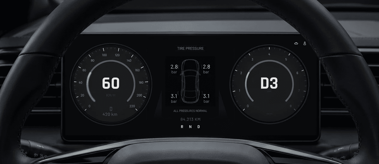
A note on visuals. This project is under NDA. All interface visuals in this case study are recreations built specifically for this portfolio: generic layouts, fictional data, no client design language. They illustrate the type of work and the thinking behind it, not the delivered product.

Visuals shown are anonymized recreations for illustration purposes; actual production interfaces are under NDA.
01
The original HMI covered an instrument cluster, a central control display, and an elongated main function screen. Each display served a different purpose within a shared design language.
Within the team’s design direction, I contributed high-fidelity screens, components and icons, interaction flows, and design documentation. My work included media-player interactions and card-based layouts for vehicle settings. I also considered localisation when defining layouts and text areas, accommodating different text lengths across English, German, and Turkish.
As the project continued, it expanded to a new vehicle model with a smaller display. We carried over the established design system while adapting to changes in information architecture and vehicle settings.
02
The smaller display introduced trade-offs in both layout and the presentation of functions. Existing key screens could not always transfer one-to-one: a familiar component could still fit visually while its original interaction no longer suited the new structure.
While developing the screens, I reviewed where direct reuse remained appropriate and where the behaviour needed reconsideration. The aim was to adapt the interface while preserving a consistent operating logic on the shared platform.
The initial phase focused on key screens. As we developed the design further, I found that some of these screens left important interaction rules open to interpretation. I proactively added wireframes and flow diagrams to make those questions concrete before discussing them with the client.
03
The context
The initial home-screen design referred to all content as Widgets. As the requirements became clearer, we established two distinct areas: an App area on the left and a Widget area on the right, each with different interaction capabilities.
The unresolved question
The initial key screens did not fully explain how these areas should behave across different layouts or how their content could be edited. This left room for different interpretations and led to recurring misunderstandings between our team and the client.
My approach
Ahead of a client meeting, I proactively redrew the structure as wireframes and mapped the layout transitions and editing flows in Figma. I made the rules explicit and highlighted the points that still needed confirmation.
One example was switching from two small Widgets to one large Widget: the first remained visible, while the second could be reached by swiping to the next page. Mapping this transition clarified how content carried over between layouts.
The result
Once the logic was clarified and agreed, the same disagreement about the App and Widget areas stopped recurring in subsequent discussions. The diagrams provided a shared reference for continuing the design work.

04
Alongside the screen work, I continued refining shared components, icons, and design documentation.
The new-model adaptation extended my contribution beyond producing the requested key screens. I identified where the existing designs left behavioural questions unanswered and helped bring those questions to resolution.
The project is ongoing. In the App and Widget work, the concrete outcome so far is a clearer agreement between the client and design team about how the interface should behave.